so, our quilt guild participated in the big modern quilt guild’s michael miller challenge. we received some madrona road fabrics in the blue/yellow/black colors and we were allowed to use any solid or any other madrona road fabric. furthermore, to kick off our guild’s new relationship with senior services, we decided to make wheelchair quilts which are about 35″x35″.
i got the bright idea that i wanted to try equilateral triangles. my encouraging pal lee loaned me her triangle ruler and i went to work. (note: our fabrics were in semi-fat-eighths so, cutting equilateral triangles was probably the least efficient use of this fabric possible).
anyhow… here’s the final product…
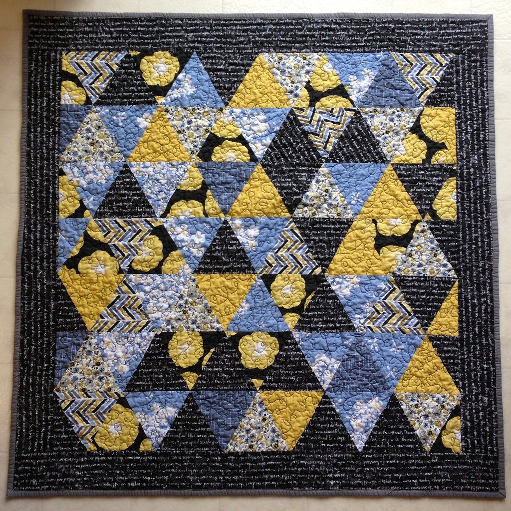
i did a terrible job keeping track of my rows and the final layout was not quite as evenly distributed as the original layout. i was mostly frustrated throughout the entire piecing process. i managed to cut the end pieces wrong, so i had to hack off more fabric to even up the rows. which resulted in a super tiny quilt. so, i needed a border. which gave me an excuse to get more text print. i needed 1/2 yard. i bought a whole yard. 🙂
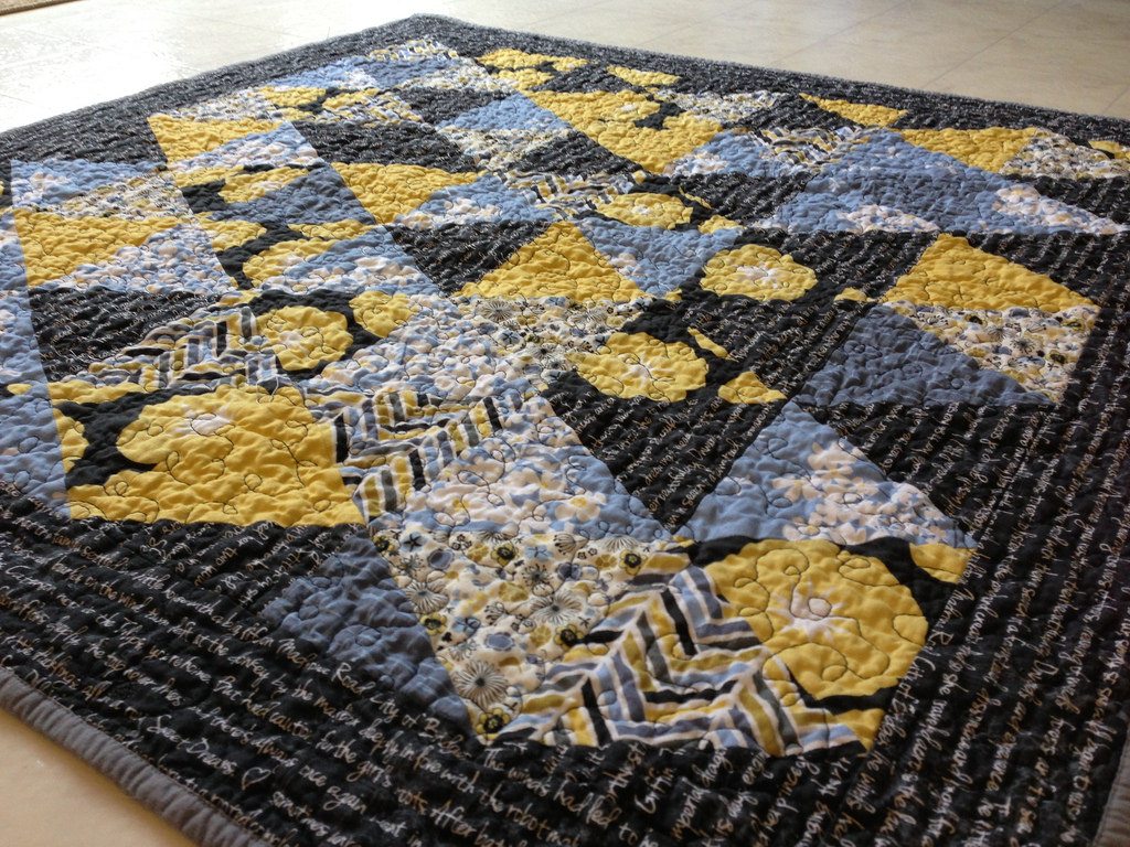
i quilted it with some loopy swirly free motion. i chose black for the top thread, and it shows every last little mistake. but, whatever. if i had chosen something else, it would have shown on the black. i used a gray solid on the back and had just enough left for the binding.
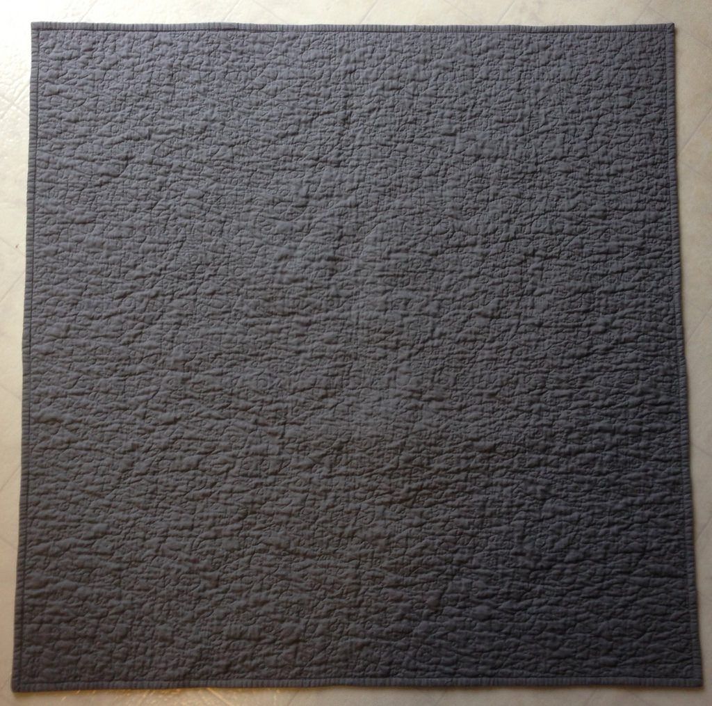
oh. the binding.
i finished the quilting awhile back. and made the binding. and then it sat. and sat. and sat. finally, this morning, i snuck down to put the binding on while anna played nicely and/or opened and took one bite out of 5 bananas.
it’s not my best work. but, i was so over this quilt by this point, i didn’t care. i never loved it. hopefully someone else will.
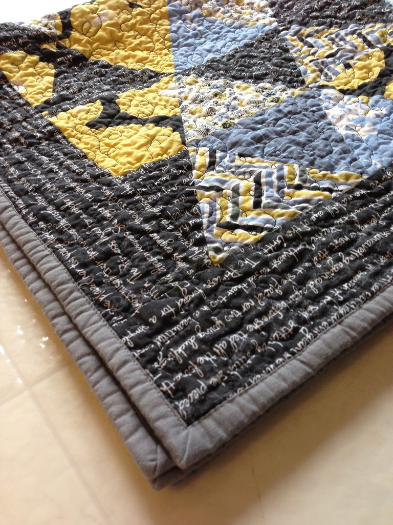
here’s a rolled up picture, because that’s what quilt bloggers do.
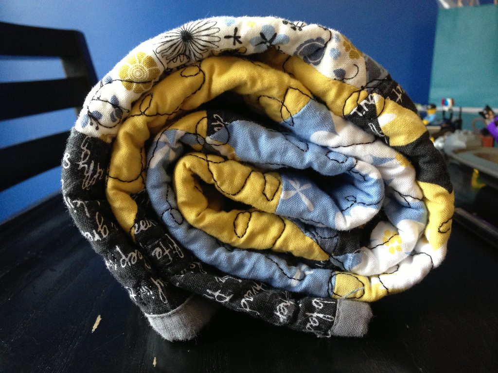
oh. and this is my first finish of 2013. blerg.
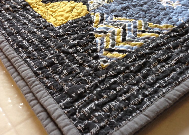
I think the triangles are lovely and personaly like the chunky border.
It looks great! Love how you got extra text! I did the same for a text swap Im in.
It’s not blerg, I like it. The layout looks better than you think. And hey, it’s done!
I love it!! I looked at every quilt in that Flickr pool and this is one of my faves. It is definitely not blergh. The text border looks fine and it would not have seemed like an afterthought if you had not said so. 🙂 I hope that it goes to someone who can appreciate it. I’ve never done equilateral triangles before but am cutting for my first project right now… hope my piecing looks as nice as yours.